Home

Nautilus - About

About the Nautilus Diagram

Back to the interactive visualization

The scholarly literature is a vast store of formalized human knowledge, interconnected by citations between publications.

Looking at these citations is one way to measure the influence of scholarly research. Metrics like h-index—prominently displayed by services such as Google Scholar—measure influence by counting citations. But with more complete data about these citations getting better and more accessible every day, we can do better.


The scholar visualization tool shows the influence a central collection of publications has had across different fields, telling the story of how this influence has developed over time. The collection of interest (representing, for example, an author, or an emerging field) is shown as the central node in a network, and other papers that have cited papers in this collection are shown as circular nodes surrounding the central one. The animation progresses forward in time; as new papers appear, they send out links representing citations, both to the central node and to other nodes that appear in this network.

Image explaining the network diagram. The center node represents all of the papers authored by the scholar of interest. Surrounding nodes represent papers that have cited work by the scholar of interest. Lines between the nodes show citations between papers. Papers are revealed by year in a spiral formation, so that earlier papers appear closer to the center. Showing a scholar's influence: The size of each node is scaled by the Eigenfactor score of that paper—a metric of influence that takes into account its position in the total citation network. Bigger nodes represent the most influential papers that have cited the central scholar. The color of each node shows the academic discipline of the paper. A more colorful network means that the impact of the central scholar’s work has extended out to a wider range of fields. The color of the center node represents the dominant field of the central scholar—the most common field of all the scholar’s publications.

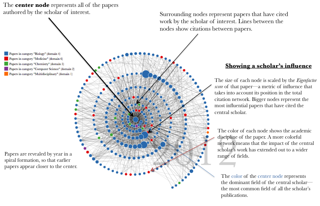
In order to reduce the visual complexity of the graph, not all of the papers that have cited the central collection are represented. Rather, the most influential papers (by Eigenfactor score) are selected to be visualized as nodes in the network.

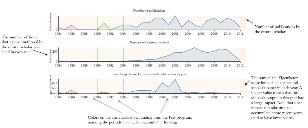
Below the network diagram, line charts show key indicators over time:

Image explaining the line charts. Top chart: Number of publications by the central scholar. Middle chart: The number of times that a paper authored by the central scholar was cited in each year. Bottom chart: The sum of the Eigenfactor score for each of the central scholar’s paper in each year. A higher value means that the scholar’s output in this year had a large impact. Note that since impact can take time to accumulate, more recent years tend to have lower scores. Colors on the line charts show funding from the Pew program, marking the periods before, during, and after funding.


Contact

Please contact us if you have any questions or comments about the tools, data or other content.