Mapping Misinformation and Science Communication Research
Background
Over the last decade, the world has seen a rise in misinformation. The World Economic Forum identified this rise as an existential threat to society, on par with terrorism, cyberwarfare, and global governance failure. Most of the attention has centered on misinformation about politics, government propaganda and festering conspiracy theories. Relatively less attention has been given to misinformation in, and about, science. Misappropriated nutritional advice spreads virally in the news and on social media, measles outbreaks due to lowering vaccination rates are creating states of emergencies in the U.S., predatory journals are fooling both the public and researchers themselves, and videos promoting the flat earth theory are commonly recommended on YouTube.
The goal of this project is to shed light on who is working on this topic of science misinformation and how this emerging, interdisciplinary domain connects across the disciplinary landscape. The research and publication data draws heavily from science communication research, as one would expect, but the publications also arise from psychology, education, science and technology studies, journalism, computer science, and others. Using bibliometric maps, we examine the state of the field through interactive visualizations, co-authorship graphs, and keyword analysis. This is built on publication data that has been generated from a National Academy report on science communication, topic-based search queries from major bibliographic databases, and machine-learning methods that crawl the literature for related papers. This represents preliminary, exploratory work in a rapidly changing field, and we plan to update the data as new papers and trends emerge.
We focus on two areas of research for this project: science communication and misinformation research. We chose these two areas based on a talk series sponsored by the National Academy of Sciences around misinformation and science communication. Clearly, there is strong overlap between science communication and the topic of science misinformation. This is why we brought them together. For some of the maps, we combine the two. In other areas, we focus primarily on science communication. We note this for each of the tools.
Again, we stress that this is a preliminary analysis and does not represent all papers in science communication or misinformation research. We will update as the data becomes available.
Below we provide a summary of each of the tools. Please contact us if you have any questions or comments.
Data, Tools and Maps
There are five sections listed in the navigation for this site: "Data and Methods," "Automated Bibliography," "Co-authorship Maps," "Keyword Maps," and "Nautilus Diagram". Each is explained briefly below. More details can be found by clicking through to each page.
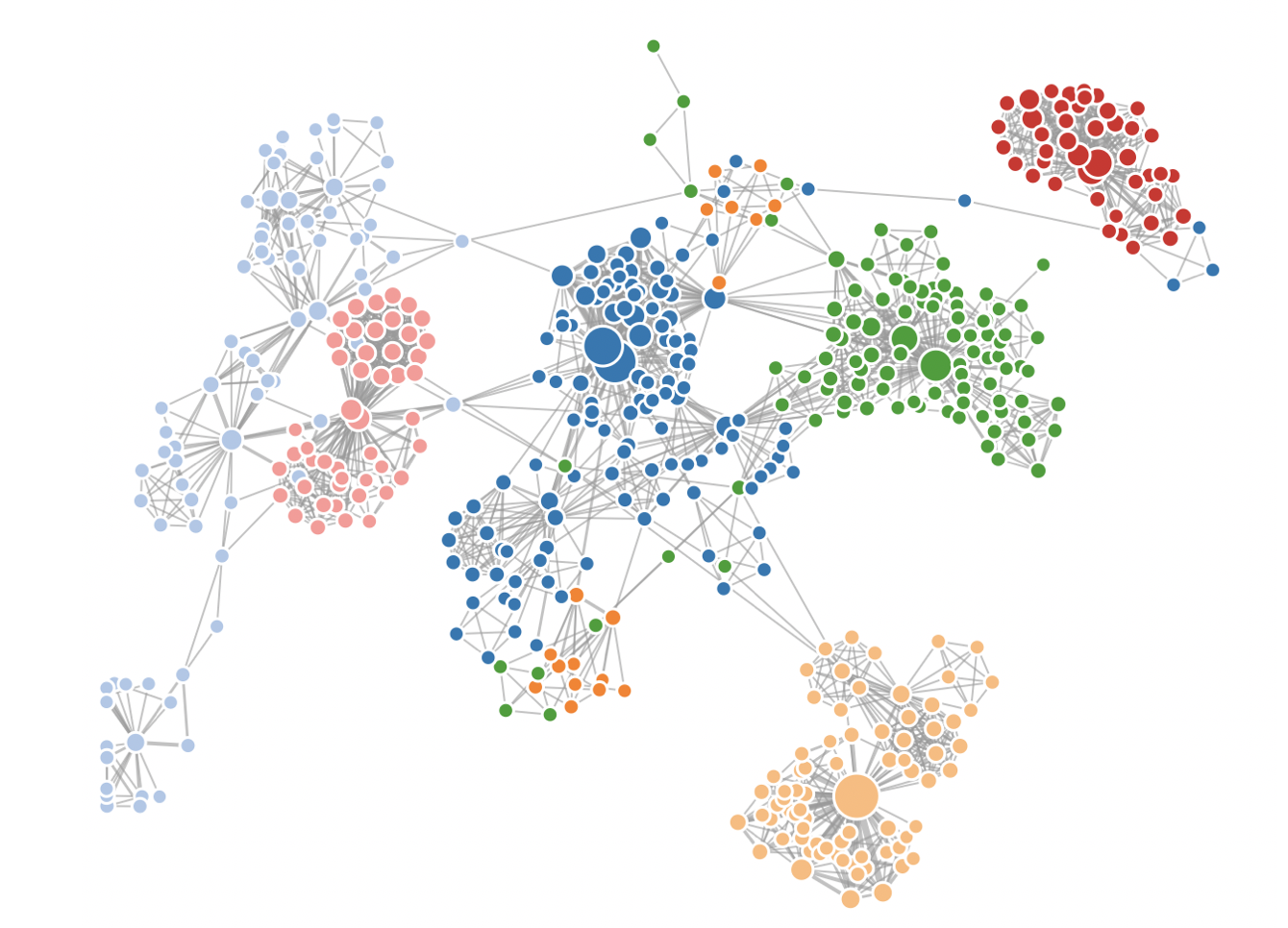
The Co-authorship Maps provides an interactive map to explore the authors and social structure of these emerging fields. In this network, the nodes represent authors and the links represent shared publications. If an author shares many publications with another author, the link will be thicker. This provides an overview of the field based on these author relationships. We provide two papers: one with science communication and misinformation together and another with science communication research only. You can scroll over the authors to see representative papers by each author. In the version of just science communication, you can search the authors either in the map or the author table on the right-side of the screen. We caution against making too strong an inference of author influence since the data is only a sample from the literature.
The Keyword Maps creates similar maps as the Co-authorship Maps, but instead of nodes being authors, the nodes are keywords extracted from the titles and abstracts of the papers in our data set. We create two maps: one for science communication and misinformation research combined and one for science communication only. We provide details on the cutoffs and requirements for keywords on the "Keyword Maps" page.
The Nautilus Diagram is an interactive visualization tool for evaluating the influence of a field's work outside that field. In other words, we look at the important papers in other fields that are citing our field of focus — in this case, the field of science communication and misinformation research. The center node in this nautilus diagram represents the seed papers in the field of science communication and misinformation research. The outside (colored) nodes represent important papers over time. The more inner nodes are papers from the more distant past and the outer nodes are papers more recently published. The size of the node represents influence measured by citation network measures. The colors represent fields of study. We also provide basic paper and citation counts of the field of focus below the diagram. More details can be found on the webpage that displays the nautilus diagram. (Please note that the nautilus diagram can take up to a minute to load.)
The Data and Methods provides information about our seed sets, and the methods we used to map and generate new papers. The seed set is approximately 1000 papers. We expand this set (see "Automated Bibliography"). We make all the publication data generated for this project easily available through a direct download or through interactive tools and maps.
The Automated Bibliography is a tool we developed to automatically identify related papers around a given topic. The method is described in this publication, and the code is available here. The method starts with a seed set of papers. In this case, the seed set is the reference list of a National Academy report and an initial search query of research papers on the topic of misinformation. We can then crawl the citation network of this seed set and identify papers that are similar using a supervised machine learning model. We provide two automated bibliographies: one that includes 100 related papers in the research area that spans both science communication and misinformation research, and another that provides 1000 related papers in science communication only. We can add more papers if requested.
Contact
Please contact us if you have any questions or comments about the tools, data or other content.